|
|
Post by RA'KHARII on Jan 16, 2012 21:07:06 GMT 8
I do not know if there are any Masters of Photoshop Sorcery on the site but I would greatly appreciate a possible signature if anyone can find it in their hearts to make one |
|
blue
Administrator
s e r e n d i p i t y ,
Posts: 3
|
Post by blue on Jan 17, 2012 17:45:10 GMT 8
I'm no master, but I'd be more than happy to make you one. I'll have to know if you want anything specific on it, though. Like, certain images, text/lyrics/names, font styles, colors? |
|
|
|
Post by RA'KHARII on Jan 17, 2012 22:22:50 GMT 8
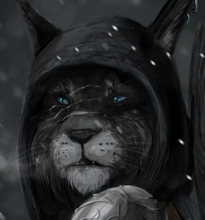
You would? Awesome. The picture I want used is here and for colors, I'm pretty good with dark colors to match the picture. With the words, I wanted ''Ra'Kharii'' somewhere up in the top left corner then the words "May you always were soft silks" along the bottom. I don't know much about fonts but one that looks hand written would be awesome. Go ahead and take your time with it, we're not in any type of rush |
|
blue
Administrator
s e r e n d i p i t y ,
Posts: 3
|
Post by blue on Jan 18, 2012 17:29:53 GMT 8
So, I didn't quite like how I made your first one, so I redid it and, thus, you have two signatures to pick from. They're not my best work and I don't really like how they turned out, but I hope they're alright (personally, I hate "top corner, separate bottom corner" text placement). If you don't like either, feel free to ask me to change anything! |
|
|
|
Post by RA'KHARII on Jan 18, 2012 22:29:46 GMT 8
I like the first one since he matches the background but the only thing I would change would be the size of the words. Maybe you can change the size of his name to being a lot smaller, like this kind of smaller. The saying doesn't bother me that much other then it's so bright. I love the background, it's a part of the Ratways, isn't it? if you could darken the background a tad bit so he doesn't stand out as much. Honestly, if you only fixed the text, I probably would be fine with it. Thank you so much, again, for doing this for me |
|
blue
Administrator
s e r e n d i p i t y ,
Posts: 3
|
Post by blue on Jan 20, 2012 20:32:42 GMT 8
Any better? I'm assuming you didn't literally mean font size 1, (which is about 9 in PS, and would be pretty darn unreadable) so I just halved its previous size. I also darkened the stroke around the saying (which I'm guessing is the part you meant when you said it was bright, because the font color itself is the same as his name's) and blended him into the background a little more. If you need more done, you know what to do. |
|
|
|
Post by RA'KHARII on Jan 23, 2012 22:57:36 GMT 8
It's great, thank you for making it for me! <3
|
|